RocCurveDisplay#
- class skore.RocCurveDisplay(*, fpr, tpr, roc_auc, estimator_name, pos_label=None, data_source=None)[source]#
ROC Curve visualization.
An instance of this class is should created by
EstimatorReport.metrics.roc(). You should not create an instance of this class directly.- Parameters:
- fprdict of list of ndarray
False positive rate. The structure is:
- for binary classification:
the key is the positive label.
the value is a list of
ndarray, eachndarraybeing the false positive rate.
- for multiclass classification:
the key is the class of interest in an OvR fashion.
the value is a list of
ndarray, eachndarraybeing the false positive rate.
- tprdict of list of ndarray
True positive rate. The structure is:
- for binary classification:
the key is the positive label
the value is a list of
ndarray, eachndarraybeing the true positive rate.
- for multiclass classification:
the key is the class of interest in an OvR fashion.
the value is a list of
ndarray, eachndarraybeing the true positive rate.
- roc_aucdict of list of float
Area under the ROC curve. The structure is:
- for binary classification:
the key is the positive label
the value is a list of
float, eachfloatbeing the area under the ROC curve.
- for multiclass classification:
the key is the class of interest in an OvR fashion.
the value is a list of
float, eachfloatbeing the area under the ROC curve.
- estimator_namestr
Name of the estimator.
- pos_labelint, float, bool or str, default=None
The class considered as positive. Only meaningful for binary classification.
- data_source{“train”, “test”, “X_y”}, default=None
The data source used to compute the ROC curve.
- Attributes:
- ax_matplotlib axes
The axes on which the ROC curve is plotted.
- figure_matplotlib figure
The figure on which the ROC curve is plotted.
- lines_list of matplotlib lines
The lines of the ROC curve.
- chance_level_matplotlib line
The chance level line.
Examples
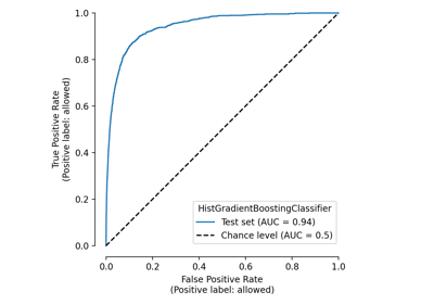
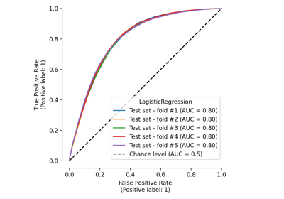
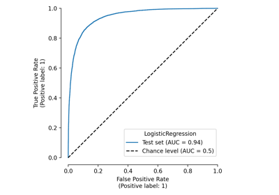
>>> from sklearn.datasets import load_breast_cancer
>>> from sklearn.linear_model import LogisticRegression
>>> from sklearn.model_selection import train_test_split
>>> from skore import EstimatorReport
>>> X_train, X_test, y_train, y_test = train_test_split(
...     *load_breast_cancer(return_X_y=True), random_state=0
... )
>>> classifier = LogisticRegression(max_iter=10_000)
>>> report = EstimatorReport(
...     classifier,
...     X_train=X_train,
...     y_train=y_train,
...     X_test=X_test,
...     y_test=y_test,
... )
>>> display = report.metrics.roc()
>>> display.plot(roc_curve_kwargs={"color": "tab:red"})
- plot(ax=None, *, estimator_name=None, roc_curve_kwargs=None, plot_chance_level=True, chance_level_kwargs=None, despine=True)[source]#
Plot visualization.
Extra keyword arguments will be passed to matplotlib’s
plot.- Parameters:
- axmatplotlib axes, default=None
Axes object to plot on. If
None, a new figure and axes is created.- estimator_namestr, default=None
Name of the estimator used to plot the ROC curve. If
None, we use the inferred name from the estimator.- roc_curve_kwargsdict or list of dict, default=None
Keyword arguments to be passed to matplotlib’s
plotfor rendering the ROC curve(s).- plot_chance_levelbool, default=True
Whether to plot the chance level.
- chance_level_kwargsdict, default=None
Keyword arguments to be passed to matplotlib’s
plotfor rendering the chance level line.- despinebool, default=True
Whether to remove the top and right spines from the plot.
Examples
>>> from sklearn.datasets import load_breast_cancer
>>> from sklearn.linear_model import LogisticRegression
>>> from sklearn.model_selection import train_test_split
>>> from skore import EstimatorReport
>>> X_train, X_test, y_train, y_test = train_test_split(
...     *load_breast_cancer(return_X_y=True), random_state=0
... )
>>> classifier = LogisticRegression(max_iter=10_000)
>>> report = EstimatorReport(
...     classifier,
...     X_train=X_train,
...     y_train=y_train,
...     X_test=X_test,
...     y_test=y_test,
... )
>>> display = report.metrics.roc()
>>> display.plot(roc_curve_kwargs={"color": "tab:red"})
Gallery examples#
EstimatorReport: Get insights from any scikit-learn estimator